It is usually better to buy those shares which are members of an industry group which is leading the market's move. Here is how you can identify outperforming groups...
 Most stocks can be classified according to groups -- in the United States, for example, General Motors, Ford and Chrysler in the automobile group; ASA and HOMESTAKE in the goldmining group, etc.
Since most companies within a group tend to move in unison, monitoring their performance can be helpful in various ways. By charting the performance of each group, you can quickly see which ones are leading an advance and which are lagging behind.
If you intend to buy particular stocks, the information can make the selection process much easier. Needless to say, it is usually better to buy those issues which are members of an industry group which is leading the market move.
Relative strength tracks industry groups in comparison to the market as a whole. The performance of each group is compared individually to the performance of a market index over a selected period of time, allowing you to analyse whether it is outperforming or under performing the general market. A ranking can then be assigned to each industry group in terms of its relative strength.
We have developed three methods which will allow you to monitor the performance of the industry groups.
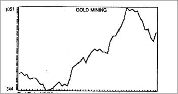
The first approach plots a chart for a specified industry group showing its performance over the most recent one-year period. This allows you to easily monitor the trend of the group itself as illustrated by the example in Figure 1.
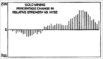
The second approach studies the group's performance relative to the market index during the same period. These data can add greatly to your information.
For example, while the results of approach # 1 may show the index of a particular group gaining in price, the results of approach # 2 might show the group to actually be lagging behind the market as a whole. On the other hand, the particular group may be seen to be in a downtrend, while examination of the relative strength chart shows that the group is still performing relatively better than the market as a whole.
Finally, when you are looking for short-sale targets, this indicator will alert you to which industries are the weakest.
Figure 2 is an example of the results of approach # 2. Since it is in the form of an oscillator, the industry index may oscillate above or below the center line which represents the New York Stock Exchange Composite Index.
The third approach ranks each industry in terms of relative strength. A rating of 100.00 would mean that the industry performance matched exactly that of the market index during the given period. A net-change figure is also produced denoting the change from last week's reading.
Whereas the charts from approach #2 give a historical perspective, the report generated from approach #3 gives a relative strength "snapshot" showing at a glance the current strongest industry groups as illustrated by the example in Figure 3.

[Excerpt from Timing the Market: How to Profit in Bull and Bear Markets With Technical Analysis (www.visionbooksindia.com/details.asp?isbn=817094662X) published by Vision Books]
(C)All rights reserved.