
Photographs: Reuters Priyanka Sharma in New Delhi
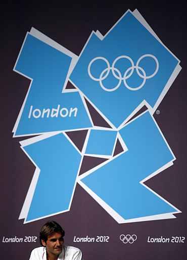
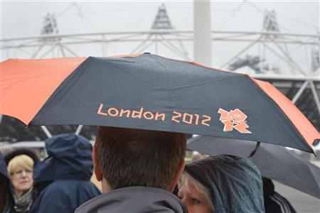
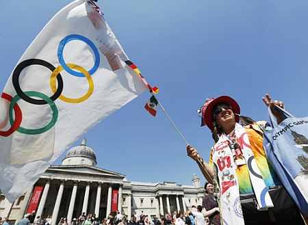
If you're visiting London, you will find a strange emblem decorating various lamp posts, subway stations and prominent eateries in the city. It is a set of jagged lines in a series of shades of pink, blue, green and orange.
Upon closer inspection, you notice the date '2012' etched into it. This is London 2012, the logo of the London Olympics and Paralympic Games, designed by branding agency Wolff Olins.
When it was launched back in 2007, the logo was met with great scrutiny and displeasure, leading to a fierce debate about the visual identity of the London Games.
...
Why the designers of the Olympic logo broke all rules

Photographs: Reuters
After all, it seemed to flout all rules of traditional Olympic branding: fuss-free five rings encircling the host city's iconography. Naturally, Londoners expected The Big Ben, The Houses of Parliament or even the London Eye in their logo.
"The logo eschewed everything that was jingoistic and nationalistic," counters a proud Ije Nwokorie, Managing Director at the agency's London office. Simply put, Wolff Olins as well as their primary client, the London Organising Committee of the Olympic and Paralympic Games (LOCOG) didn't want a cliche.
So did they have a handbook of design guidelines to follow? "No," says Nwokorie. "The LOCOG was in agreement with us that it was time to break the rules." In the last five years since its launch, the logo has come to define the identity of the Games: modern and edgy. It sends out the message that the Olympics are no longer just for the elite, but for the masses.
...
Why the designers of the Olympic logo broke all rules
Photographs: Toby Melville/Reuters
"The Olympics will not just be a two-week event, but something that extends beyond sports and into culture. Participation is the central driving force behind the Olympics," explains Nwokorie.
Containing neither sporting images nor pictures of London landmarks, the emblem shows that the Games are more than London, more than sport, he feels.
Theirs was a fairly traditional pitch, says Nwokorie. Before their client (the LOCOG), the Wolff Olins team came up the idea of "An Olympics like never before".
The idea continues to drive the brand till date, believes Nwokorie. With the world's best technology at their disposal, the team understood the need to connect with the consumer. "The consumer wants to be in control of what he sees," he adds.
...
Why the designers of the Olympic logo broke all rules
Photographs: Lucy Nicholson/Reuters
The agency had also created the logo for the 2004 Athens Olympics where they competed against thousands of entries.
"In Athens, the branding was just about a logo. But there was no thought or idea behind the brand," says Wolff Olins managing director Charles Wright. "By contrast, London 2012 has a clear idea and thought behind it. And the design of the logo, is an expression of that idea."
It took a team of around 12 at Wolff Olins, who worked round the clock, tossed ideas back and forth before they came up with the logo.
The process took around 18 months and involved not just a visual identity for the Olympics but a multi-pronged strategy to engage sponsors and get Londoners excited about playing hosts for the third time, adds Wright.
...
Why the designers of the Olympic logo broke all rules
Photographs: Reuters
And mind you, he adds, this was six years before the Olympics had to take place. Sociologists and designers brainstormed; while some sketched, others came up with tangible activities.
According to a recent evaluation by Brand Finance, the Olympics 'brand' is valued at $47.6 billion, with an 87 per cent increase since the Beijing Olympic Games in 2008 (where it was valued at $25.4 billion).
If the report is to be believed, interestingly, this makes the London Games the second-most valuable brand in the world after Apple (valued at $70.6 billion) and worth more than all of its major sponsors including Samsung, GE and Coca-Cola.
...
Why the designers of the Olympic logo broke all rules
Photographs: Luke MacGregor/Reuters
The four years since Beijing has seen a total revenue growth of 38 per cent to $5.1 billion, broadcasting revenue growth of 51 per cent to $3.9 billion, but sponsorship revenue growth was only 10.5 per cent perhaps reflecting tough trading conditions in the worldwide recession.
Broadcasting contributes two-thirds of the IOC's revenue The Olympics, believe the two MDs, has added to the city's perception as a modern yet aesthetic city. Also, they believe, the associative activites of the Olympics have led to urban regeneration in several parts of east London, which were "historically deprived".
...
Why the designers of the Olympic logo broke all rules
Photographs: Reuters
"This is the first time the Olympics is not anchored around its host city," says Nwokorie. "This might be controversial, but I think London gives more to the Olympic brand than vice versa!"
So while London 2012 might cease to exist after the Olympics, the infrastructural benefits, influx of tourism and the economic bounty created by the brand, will hold the city in good stead for years to come.

article