Jhanvi Madan (not her real name), who lives in Mumbai , has been talking on her cellphone. Unknown to her, a stranger on the other side of the road is observing her carefully and taking copious notes.
There's no cause for alarm, however. The person taking those notes is one of the 320 designers from the world's largest handset maker, Nokia. Her name is Younghee Jung, and she's a senior design specialist who flew all the way from the London Design Studio to spend around two weeks in Mumbai and some mofussil areas to understand how Indians use cellphones.
"This is a very common practice among us," says Nikki Barton, head of digital design, Nokia Design Studio. People and their behaviour 'are Nokia's prime concern'.
"We all have different views on how a phone should look and what it should do," acknowledges Barton, adding: "Nokia has to cater to thousands of users and we have to ensure that all of them are happy."
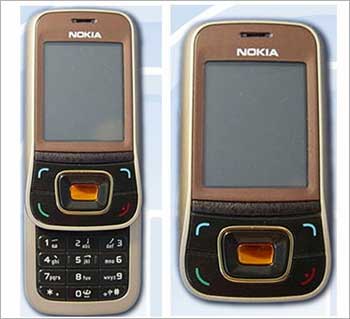
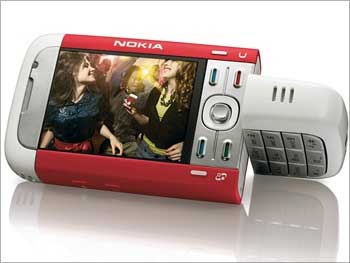
Nokia has nearly 40 per cent market share globally, and nearly 60 per cent in India unlike Apple which is better known for more aesthetic designs but has a much lower market share.
Nokia doesn't focus on just a single design or specific part of the market. Instead, its designers keep track of different needs and lifestyles by conducting detailed research and street anthropology (like Jung does) all around the world. The team includes product designers, interactive designers, anthropologists (to understand cultural behaviour), and psychologists (to understand human behaviour) from 34 nationalities.
Based out of four main design studios in Espoo (Finland), London, Beijing, and Calabasas (the US), the team gets a mix of ideas and perspectives which are brought back to the studious. The teams then discuss these ideas over phone, video-conferencing, instant messaging and emails.
Based on this understanding, the design teams then use technology to create shapes, textures, features and new interactions that people love and want to use.
Each Nokia design is guided by three broad principles -- "should be something special; a joy to use and look at; and no one design for everyone".
In keeping with these principles, Nokia's design team is also developing and evolving the images or "icons" which help us navigate our devices.
"The challenge is to make new icons but keep the familiarity of the old, so that people don't have to relearn the way they use and understand their devices. This involves working with people around the world to test and develop the icons, incorporating different cultural responses to images and coming up with one global language that can be understood by everyone using a Nokia device wherever they are in the world," says Barton.
Nokia also lays emphasis on maximising the screen size with content (applications). But how does it avoid clutter with too many icons on the screen? "It's a challenge, and we're conscious of it. We take a lot of feedback in this regard," says Barton.
Nokia, according to Barton, is now looking at making these new ways of using the device in 'as natural and human way as possible. Our design team is conducting research with real people around the world to understand whether and how a range of natural gestures such as shaking hands, pointing or even kissing could translate into the digital world'.
Nokia's design team has been working on potential new ways to personalise your device which includes looking at ways to match your device to your mood, location, time of day, or the context of what you are doing, helping to make the overall experience more relevant and enjoyable.
"There's a challenge here too. You could be at home but working. So we are trying to figure out how such problems can be tackled," says Barton.
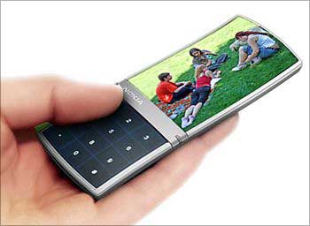
Nokia's design teams also work closely with the research and development (R&D) teams. And the results are there to see. Nokia may not be an Apple when it comes to designs, but their concept designs are a sight for sore eyes.
For instance, last May, the Nokia Research Centre and University of Cambridge developed Morph, a nanotechnology concept which demonstrates how future mobile devices might be stretchable and flexible, allowing the user to transform their mobile device into radically different shapes.
Elements of Morph might be available to integrate into handheld devices over the next few years, though initially only with high-end phones.
"A mobile is a very personal object. One you keep close to you at all times -- whether in your bag or tucked into your pocket," says Barton, concluding: "It is more than just a piece of technology."