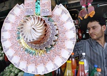
Very soon, the Indian Rupee too will get a distinct identity -- an identification symbol -- like the world's major currencies (Dollar, Pound Sterling, Yen and the Euro) have.
The Indian government had announced a competition in March last year inviting creative designs from Indian residents to represent the rupee in a simple form.
The finance ministry guidelines stated that the symbol should represent the historical and cultural ethos of the country. It should be applicable to a standard keyboard and has to be in the Indian national language script or a visual representation of it. The size of the final design should not be smaller than 232 square cm (36 sq inches).
Five designs were short-listed from over 25,000 applications received from across the country. The short-listed candidates made a presentation on the design in December and the winning design is set to create history in March.
The five selected designs are simple, easy to write and are designed to appeal to the Indian and international community. Some of these designs reflect the Devanagari script.
The finalists are not allowed to reveal the details of their design till the results are declared, expected in March 2010.
So what does it take to design a symbol of a currency? Click NEXT to find out what the creative brains, whose Rupee symbol designs have been short-listed, have to say. . .
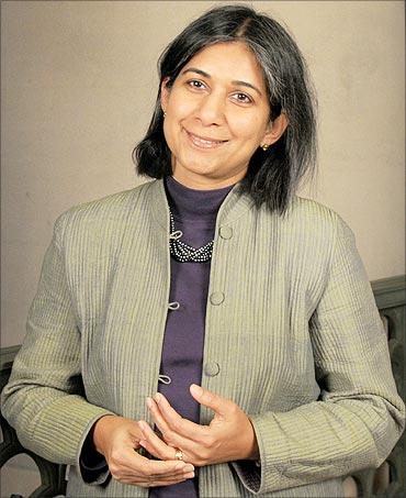
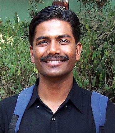
Nondita Correa-Mehrotra had written to the Reserve Bank of India in August 2005 suggesting a symbol for the Rupee. But she did not get any response. So when the competition was announced, it came as a pleasant surprise to her.
"The competition has generated many ideas and engaged a wide spectrum of professional designers as well as other citizens with over 25,000 entries," says Nondita Correa, daughter of renowned architect Charles Correa.
A Harvard University-trained architect, she is also a lecturer of architectural design at the Massachusetts Institute of Technology.
Nondita is hopeful -- just like the other finalists -- that her design will be selected as the one to represent the Rupee. She believes that she has a strong idea and her design is not only is an elegant symbol but more importantly easy to recognize and very adaptable to both print and handwriting.
"We often think that through architecture we can change the way people live and organise space, but very few buildings really reach as many people as this symbol would," she points out.
The need for a symbol
I think our Rupee suffers from not having an identifiable symbol. With a symbol we would be poised to represent our economic liberalisation as, perhaps, quite soon the Indian currency will be traded globally.
The other reason for a symbol is visual clarity, and this is why it first occurred to me that we needed one. At times we write 'Rs.' and sometimes just 'Rs', and the full stop after the Rs often can be confused with a decimal point. Also, Rs takes up two spaces. And these are just the problems in English -- every Indian language has its own abbreviations!
To be internationally recognisable, the symbol needs to clearly represent two characteristics -- that it is Indian, and that represents a currency.
The process of designing
I didn't know about the competition until a few days before the deadline. My son found the announcement on a website and told me about it. It then took a couple of days to draw up, refine and submit. I submitted just one entry as I think it is important as a designer to edit your ideas.
Even if you have two or three sketches, in the end you must go with one, the one that you think is the best. Only then will it have the conviction to carry through. . . .
The experience of designing the symbol
I realised in the design process that a symbol is quite different from a logo. A logo, like a corporate trade mark, has to be inflexible -- difficult to replicate unless you have the authority to do so. Corporations go to great lengths to develop a 'hard to replicate' logo.
However, a symbol, I think, is quite the opposite -- we want it to be recognisable even if it gets distorted. The symbol will be adapted to stylistic modifications in various typefaces, but more than the adaptations made by typographers, it is the fact that it will be written by hand right across this country, and even across the globe.
Women who need to write their accounts, children learning to read and write, etc will all need to recognise and effortlessly write this symbol.
This is what got me excited, the opportunity to design something that could easily be read and written by everyone.
The best currency symbol
I like the '$' sign as it is quick to write. You make the 'S' in one movement, and then the vertical line. They have realised this in the United Kingdom and over the years, tried to simplify the Pound sign ( ), but it doesn't work for me.
The is easy to write but they very quickly had to modify it as it was originally an incomplete circle, but that took up too much line space, so now they have changed its proportions.
The $ is really a brilliant symbol.
Being selected as a finalist...
To have now been selected as one of five finalists is humbling. A friend of mine put it very nicely: she said that to have this symbol chosen would mean that my design would be in every citizen's grasp. That's quite a daunting thought. It would be immensely satisfying to be chosen.
Current projects
I am working on a project in Toronto, a jamatkhana (communal gathering place) for the Ismaili community there. I enjoy being an architect, the discipline forces you to stay focused on an idea, as you are often dealing with so many diverse issues in putting a building together. . . .
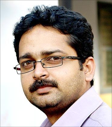
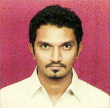
D Udaya Kumar, who is hopeful of winning the Rupee symbol design contest, says there was an underlying common element in all the five designs that were short-listed. Most of the developed countries have a symbol for their currencies and it is important for a country for India too to have a symbol for the Rupee.
"It was a challenge to design the symbol for the rupee. I made sure that it is simple, easy for a common man to understand, write and recollect," says Udaya Kumar.
Being a typographer, he spent a lot of time on the design, the finer details, visualising the designs in various sizes, resolutions, et cetera.
From his younger days, Udaya was good at art so he pursued a degree in Architecture and a master's in Graphic Design. He has won several design competitions during his college days.
He worked as a designer for Intelligent Computing Chip magazine for two years. Later, he realised the need to focus on regional typography.
Currently he is doing research at the Industrial Design Centre (IDC) at the Indian Institute of Technology-Bombay (IIT Bombay), on the evolution of the Tamil script and typographic transformation which took place from palm leaf manuscript to early letterpress printing.
The research did help him in designing the symbol for the Rupee as well.
Among the international currencies, Udaya likes Yen as it best reflects the country. . . .
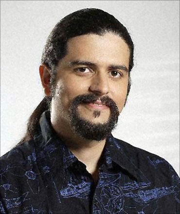
For Shahrukh Irani designing the symbol for the Rupee was the most important project in his career. It is a great honour to have been selected as a finalist, he says.
"It was a big challenge to make a symbol that transcends languages, appeal to Indians and the world. The idea was to make it simple, easy to write and at the same time have mass appeal," says Shahrukh.
It took him a long time thinking about what would work well. "It is something that will get accepted as part of our lives so the process had to be checked thoroughly," he says.
According to him, all the short-listed designs are competitive. The design elements among all the five are common though the usage and visual effect are different.
The importance of the symbol to be a part of the font has also been taken into consideration.
"We got a positive response from the officials who said all the designs were at par. It was a great feeling to know that I was among the finalists. I will not be very disappointed with the outcome if my design is not selected as all the designs are equally good. I will be happy to see any one of them being accepted."
It is like a music reality show competition where the judges themselves may have to eliminate good singers as well. Only one design has to be selected to represent the Indian currency, he philosophises.
Shahrukh finds the pound symbol decorative and dollar symbol solid. But the Pound symbol is not easy to write and the Euro symbol, though much appreciated, had its share of problems with the oval shape being similar to numbers. A symbol should be distinct and bear clarity, he affirms.
A JJ School of Arts graduate, Shahrukh Irani has been working since 1997. . . .
Getting an opportunity to design a symbol for the Rupee was itself a matter of great pride for Shibin, who works as a teacher at a government higher secondary school near Thalasserry in Kerala.
He believes that all the short-listed are equally good. "It was a great experience designing the symbol for the Rupee. All developed countries have a symbol for their currency. With India's fast-paced growth, it is important for us to have an identity for the Rupee," he explains.
It took him a few days to create the design. "We were asked to submit two sketches. I sent one sketch. The results were announced 7-8 months after I submitted the design. I had almost forgotten about it. The result was a pleasant surprise. We were given a set of guidelines. The most important aspect was to keep the design very simple so that even the common man can understand it," he says.
It was a matter of great pride for him to make a presentation at the Reserve Bank of India on the logic behind his design.
Having worked as a senior designer for companies in Bangalore, he has made hundreds of logos for companies. The experience helped him while making the design for the Rupee.
Shibin spends most of his free time designing logos, campaigns, etc. He wants to establish himself as a branding expert.
Among the various currency symbols, he likes the Euro symbol. . . .
Designing the symbol took Hitesh just a few seconds! But he devoted time to do a lot of paperwork, basically the sketching out various forms of the designs.
"It felt really good to be selected as a finalist from over 25,000 candidates. I just followed the guidelines and made sure the design is simple and can be written easily. The existing keyboards can type the symbol (of his design) using a unicode," says Hitesh Padmashali.
As the Indian Rupee is gaining importance internationally, it is imperative to have a symbol for the currency, he believes.
"The symbol is easily recognisable, has universal value and reflects the cultural ethos of the country as stipulated by the guidelines," he says.
All the designs are good so whatever the outcome is, it will be great, Hitesh says.
Designing has been his passion since childhood. His interest in music led him to designing cassette covers for personal use, since his school days. He also designed packages for jam bottles. Later, he focused on web-designing and designing logos. The experience certainly helped him during the design of the Rupee symbol.
"I like to do things that interest me. One should try to understand one's interests and focus on them and keep doing what one likes," says Hitesh who has been working for the last nine years.
Creativity should come from within, he says. He believes that to a great extent creativity is an inborn talent.
As for the results of the Rupee symbol contest, he hopes for the best and likes to take things as they come.